


- Impact
- 495

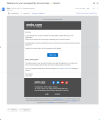
Sedo becomes better (redesign of My account section)
- Thread starter Igor Mironyuk
- Start date
-
- Tags
- sedo design... user experience

Similar threads

New posts
-
DAN.COM Domain Marketplace (Official Thread)
- 483 posters
- Inframan
-
 The USA Political Thread
- 344 posters
- marijuanadomain

Polls of interest
-
Best industry prefix?
- 20 replies
- 40 voters
-
 Which is the best price?
- 57 replies
- 171 voters
-
 What non .com extensions have you sold in 2024?
- 35 replies
- 137 voters
Popular this week
-
 HSTF.com: Seller gets questioned about value, raises price
- 8 points
- 90 replies
-
 Seller shadow bans me (deletes name after acq. attempt)
- 11 posters
- 40 replies
-
 How do end users find names?
- 2 points
- 28 replies
-
 Trademarked Name - To Dispute or Not
- 12 posters
- 16 replies
-
 ExperiedDomains.net watchlist question
- 7 posters
- 14 replies
Popular this month
-
 NamePros Parking adds Buy Now (and much more)
- 70 points
- 266 comments
-
HSTF.com: Seller gets questioned about value, raises price
- 8 points
- 90 replies
-
 Squadhelp is now "atom"
- 13 points
- 71 replies
-
 Changes coming to GoDaddy Auctions
- 7 points
- 63 replies
-
James Booth sells Galatea.com for $275K
- 13 points
- 57 replies